Are you a designer in search of the best fonts for an upcoming web design or branding project? Look no further than Jen Wagner fonts! From serif to sans serif, display, script, and handwritten fonts, her font foundry has it all.
Jen Wagner is best known for her quality-crafted designer fonts that you’ll instantly fall in love with. She calls them “swoon-worthy fonts” on her website and that couldn’t be more true!
As a former designer herself, Jen ensures that every single font and typeface she designs is done so strategically so that you don’t have to sacrifice style with your design projects. You’re getting high-quality fonts that are versatile and affordable, no compromising needed.
And at the end of this post, you might become a font hoarder like me and end up getting them all. Welcome to the Jen Wagner font fan club, friend!
The Best Jen Wagner Fonts
Since it’s incredibly easy to add a custom font to Showit, your biggest challenge will be figuring out which Jen Wagner Co font to get. With over 150 fonts available, it might be overwhelming to figure out which fonts are the best.
The good news is, you’ve come to the right place! As a self-proclaimed font hoarder, here’s a round-up of the best Jen Wagner fonts for designers.
Editor’s Note Font
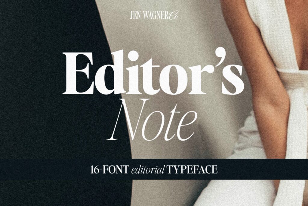
The Editor’s Note font is truly what dreams are made of. It’s a stunning 16-font editorial typeface with upper and lowercase letters, along with numbers and punctuation.
Because of its crisp, editorial design, the Editor’s Note font looks showstopping in large settings—so big headers, quotes, etc. It is also extra eye-catching when you combine the regular and italics together. Truly a *chef’s kiss* moment!
I actually use this as one of my brand fonts! You’ll see it used throughout my site for the headers. I use Editor’s Note Regular for my main, H1 headings (Title font setting in Showit). Then I use Editor’s Note Light for my secondary or H2 headings (Headings font setting in Showit).
Editor’s Note Text Font
If you love Editor’s Note as much as I do but you want to use it for smaller body copy instead of large headings, you’re in luck!
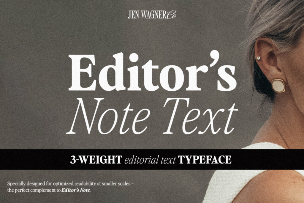
Jen Wanger recently launched the new Editor’s Note Text font! It’s a 3-weight typeface designed for text (aka smaller, body copy) so that there are no issues with readability at smaller scales.
And although Editor’s Note Text font was specifically designed for smaller-scale use, it can still be used for larger text, headers, and logos. It’s an incredibly versatile font!
Promenade Font
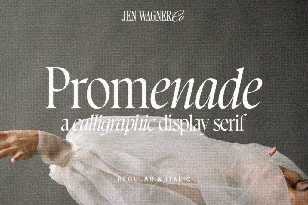
If you’re looking for a beautiful, delicate, and crips serif font that can still hold its own, look no further than the Promenade font from Jen Wagner Co. It is absolutely stunning!
As a calligraphic display serif, the flow of the Promenade font (especially in italics!!) is oh-so-swoon-worthy. It feels extremely high-end but approachable at the same time. I also love the uniqueness of the dot over the lowercase “i”—it just gives it that extra unique touch you look for in a designer font.
Sailing Club Font
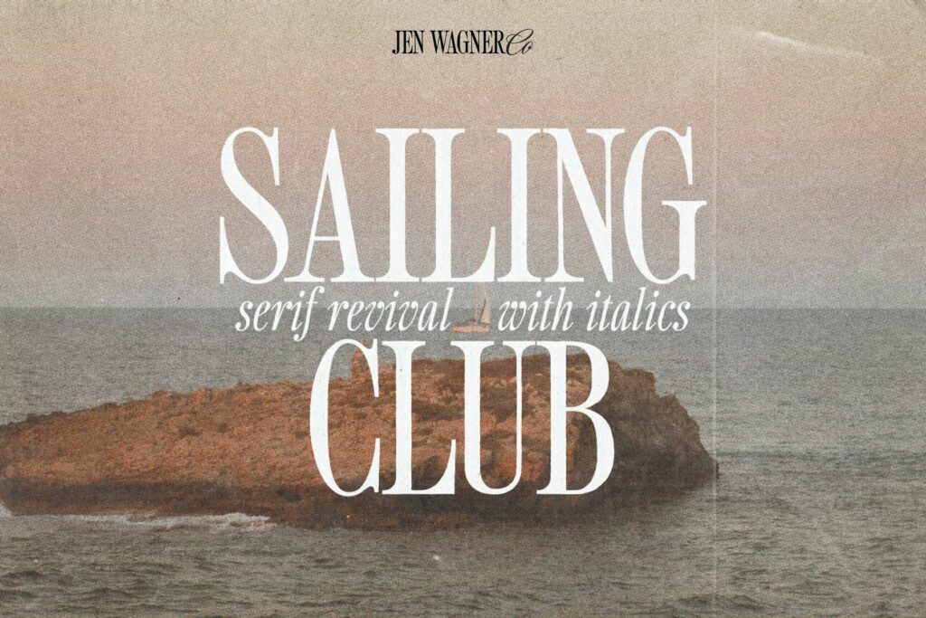
If you liked the nostalgic vibes of Perfectly Nineties, you’re going to love this one, too. The Sailing Club font gives allllll the vintage vibes and I am here for it! Especially when used in all caps with a tighter kerning…it’s perfection.
As a serif revival font with italics, the Sailing Club font is a beautifully nostalgic upper and lowercase typeface; with lots of versatility to it. It works best as display text, so things like logos, headers, quotes, etc.
Perfectly Nineties Font
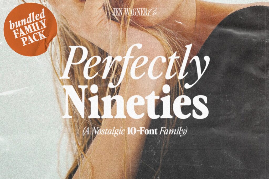
Now, if you like Editor’s Note, you’re going to love this one. The Perfectly Nineties font brings in the nostalgic vibes of more tightly spaced serif fonts from the 90s with an editorial flair to it.
A great thing about the nostalgic Perfectly Nineties font is that it can be used for both large and small settings as a display font or body text. It also includes 10 typefaces, from regular to black, and their italics counterparts.
Nineties Headliner Font
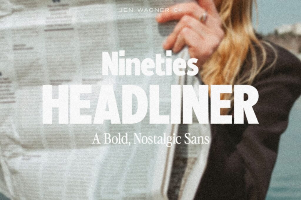
And if you liked Perfectly Nineties, you’re going to love the Nineties Headliner font. Once again, Jen nailed it with a perfect combination of nostalgic, 90s vibes with bold, clean lines.
This bold and nostalgic sans font was inspired by magazine ads. It works perfectly for logos or large headlines, be it in all caps or upper and lower case.
The Nineties Headliner font was strategically designed to pair with Perfectly Nineties, so if you have a vintage-inspired brand, these fonts were made for you!
Essential Sans Font
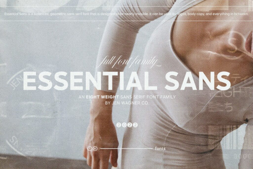
If you’re more of a sans-serif font person, this one is for you! The Essential Sans font is, well…essential (for any Jen Wagner font hoarder, that is!). And this was actually the first full typeface that Jen released!
It has 8 font weights plus italics, so 16 fonts in total. Depending on which font weight you choose, the Essential Sans font can stand out or blend in as much as you want. It’s extremely versatile!
I actually use this font as well for my brand! You’ll see it throughout my site as the body copy in the regular weight. I also use it as my subheadings, varying between Essential Sans Medium and Essential Sans Semi-Bold based on its use case.
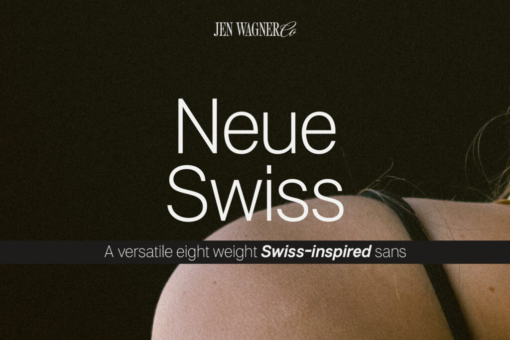
Neue Swiss Font
And for designers looking for a minimalistic yet strong sans-serif font, you’re going to love the Neue Swiss font. This is actually a new release in the Jen Wagner Fonts shop!
This 8-weight Swiss-inspired typeface is extremely versatile with its contemporary lines. With 8 font weights, the Neue Swiss font can blend in or stand out as much as needed in any design project—a true designer’s dream!
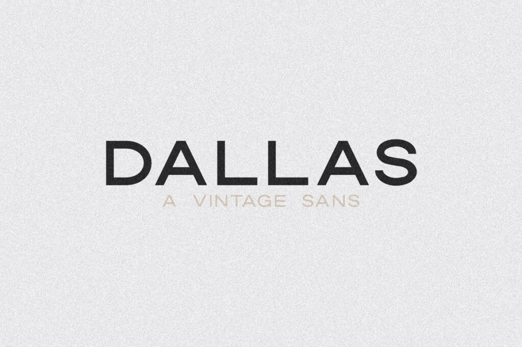
Dallas Font
The Dallas font was actually the font that introduced me to Jen Wagner fonts several years ago when I stumbled upon it on Creative Market.
(Also, buy fonts from the font foundry itself, not Creative Market—please and thank you).
The Dallas Vintage Sans font is the perfect combination of modern and vintage, which fits my personal design style perfectly. It includes 5 weights, 2 of which are outlines which gives some nice contrast and flexibility for designers.
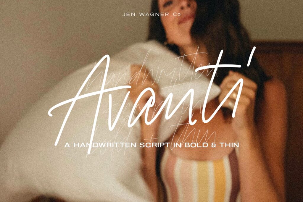
Avanti Script Font
I’ll be honest, I’m not a huge script font fan. There was a phase where using a script font as an accent on your website was THE thing to do. It felt like everyone and their Grandma was using the same script font over and over and over again.
And to me, most script fonts are really hard to read. Until I stumbled upon the Avanti Script from Jen Wagner fonts.
The Avanti Script font isn’t your typical script font. It feels more handwritten yet still legible which is SO important. It’s sort of like the girl next door of script fonts.
It comes with 122 ligatures and alternates for each letter. This allows the font to truly look more handwritten than most script fonts out there. It’s a showstopper!
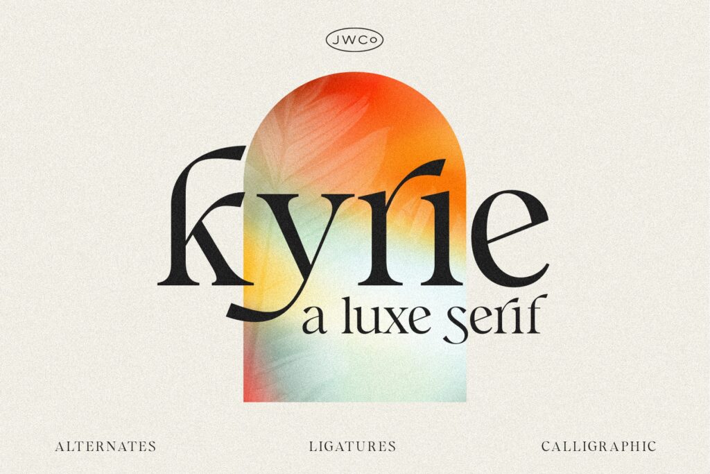
Kyrie Luxe Calligraphic Font
If you’re looking for a font with a little bit of flair to it, you’ll want to check out the Kyrie Luxe Calligraphic Serif font. With clean lines and smooth curves, this calligraphic serif is perfect for logos or large headings.
The Kyrie Luxe Calligraphic Serif has an elevated feel to it that will elevate any brand or project. The various ligatures allow you to create something truly unique as a designer.
And there you have it—a round-up fo the best Jen Wagner fonts for designers. Do you have a favorite font from Jen Wagner Co? Let me know so I can add it to the list…and my never-ending Jen Wagner font collection!
Did you love this post? Share it!
Hey there, I'm Stepf—Google Superfan & Passionate Educator
And the showit website designer and seo strategist you’ve been looking for
Through strategic Showit website design and done-for-you search engine optimization, I work with innovative and creative business owners like you to build magazine-worthy websites that effortlessly attract your ideal client—so much so that they’ll never want to leave.
Get to know me
